
Ecommerce Data Operations in Practice — RFM Segmentation and Cohort Analysis
 임재복
임재복
RFM analysis scores customers along three axes — Recency, Frequency, and Monetary value — to sort them into segments, while cohort analysis tracks a group of customers who arrived in the same period (a cohort) over time to see how retention and repeat purchases evolve. Together they answer the two core questions of ecommerce data operations: “who are our customers right now (RFM)” and “how do those customers stick around or leave over time (cohort).” This structure never shows up in a single average-revenue line. This article lays out the definitions, the calculation steps, and worked-example tables so practitioners can follow along and apply it directly.
Every figure in this article is a self-calculated hypothetical example built to explain the concept, not real data from any specific company (each table is marked “example”). The concept definitions are verified against GA4’s official documentation and industry-standard sources, and we also cover a minimal version you can start with using nothing but GA4 and a spreadsheet. We design this work from the data-science mindset of growth: finding “the one customer who will become revenue,” not chasing traffic volume.
Why does the overall average lie to you?
The metric you see most often on an ecommerce dashboard is “average revenue per user (ARPU).” Yet this single number often wrecks decision-making, because an average flattens outliers and skewed distributions into one point. Customer revenue almost always follows a lopsided distribution concentrated among a small group of top customers, and the average creates the illusion that a “representative customer” exists.
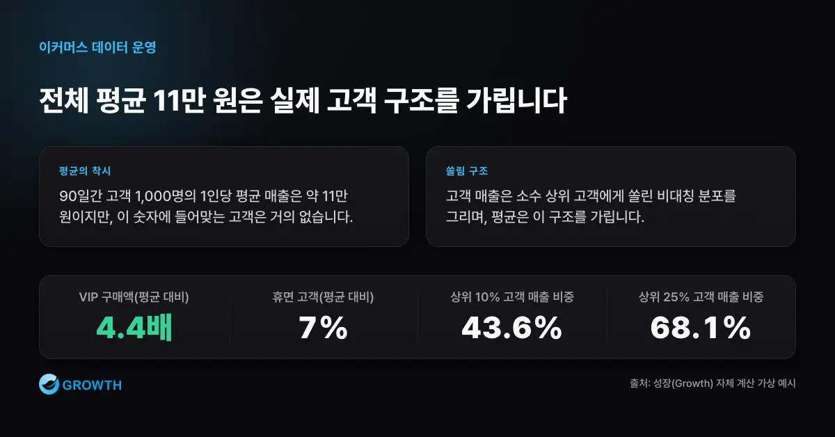
Take a hypothetical ecommerce example. 1,000 customers were active over 90 days, total revenue was ₩101 million, and average revenue per customer was about ₩110,000. Looking only at this average, it’s easy to read it as “each customer spends about ₩110,000.” But break the same data down by customer group and a completely different picture emerges.
| Customer group (example) | Customers (share) | 90-day revenue per customer | Share of group revenue |
|---|---|---|---|
| VIP | 100 (10%) | ₩480,000 | 43.6% |
| Loyal customers | 150 (15%) | ₩180,000 | 24.5% |
| Regular customers | 350 (35%) | ₩70,000 | 22.3% |
| New customers | 200 (20%) | ₩45,000 | 8.2% |
| Dormant customers | 200 (20%) | ₩8,000 | 1.5% |
Almost no customer actually matches the overall average of ₩110,000. VIPs spend 4.4 times the average, while dormant customers spend only 7% of it. The top 10% of VIPs alone generate 43.6% of revenue, and the top 25% (VIPs plus loyal customers) generate 68.1%. This is exactly why campaigns that “send an average message to an average customer” fail — the hypothetical middle customer implied by the average doesn’t exist; what actually exists is a mix of groups with completely different behaviors.
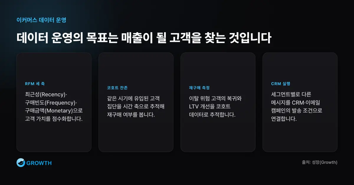
So the first step in data operations is to “drop the average and look at the distribution.” The two most proven ways to work with distribution are RFM segmentation and cohort analysis. The same logic applies when you’re evaluating ad efficiency metrics — we cover the trap of average ROAS in more depth in The ROI and ROAS Trap.
RFM analysis in practice: definitions and quintile scoring
RFM starts from a simple but powerful hypothesis: customers who bought recently, frequently, and for a large amount are more valuable. RFM analysis is a segmentation technique that analyzes customer behavior based on a customer’s most recent purchase, purchase frequency, and purchase amount (Shopify, RFM Analysis guide).
| Metric | Definition | How it’s measured | What it means |
|---|---|---|---|
| Recency | Time elapsed since the last purchase | Today minus last purchase date (in days, lower is better) | Current engagement level |
| Frequency | Number of purchases within a given period | Total order count (higher is better) | Degree of loyalty and habit |
| Monetary | Total purchase amount within a given period | Sum of purchase amounts (higher is better) | Size of revenue contribution |
Quintile scoring, step by step
The core of RFM is converting the three metrics from absolute values into relative rank scores. Each metric is scored from 1 to 5, with 5 marking the most valuable customers on that dimension (Shopify). The most common approach is quintile scoring, which splits customers into five equal groups. The steps are as follows.
- Fix the analysis window and reference date. For example, the trailing 12 months, with the reference date set to the data-extraction date. Calculate every customer’s Recency, Frequency, and Monetary value on the same basis.
- Compute each customer’s raw values. Derive days since last purchase (R), order count (F), and total purchase amount (M) per customer.
- Split each metric into five groups and score them. Sort customers by value and assign scores of 5 down to 1 in successive 20% bands. Recency runs in the opposite direction — shorter elapsed time earns a 5 — while Frequency and Monetary score 5 for larger values.
- Combine the three scores into an RFM code. For example, R5·F4·M5 becomes “545.” The code itself tells you the customer’s profile at a glance.
Below is a hypothetical example of scoring Recency (10 customers, based on days since their last purchase). The key point: the shorter the elapsed time, the higher the score.
| Days since last purchase (example) | 3 days | 8 days | 14 days | 21 days | 30 days | 45 days | 60 days | 90 days | 150 days | 300 days |
|---|---|---|---|---|---|---|---|---|---|---|
| Recency score | R5 | R5 | R4 | R4 | R3 | R3 | R2 | R2 | R1 | R1 |
Split Frequency (order count) and Monetary (total spend) into quintiles the same way, and every customer lands in one of 5 × 5 × 5 = 125 possible R·F·M combinations. You can also set the quintile boundaries directly against a business rule instead of a pure quintile split — for example, defining Monetary as “under/over ₩100,000.” What matters is applying the same rule to every customer so relative positions stay consistent.
Nine RFM segments and the action for each
Using all 125 raw combinations directly is unmanageable. That’s why practitioners group R·F·M combinations into standard, meaningful segments. The industry commonly groups RFM score combinations into named clusters — champions, loyal customers, at-risk customers, and so on — and pairs each with a tailored campaign (Optimove, RFM Segmentation). Below are the nine segments most commonly used in practice, with recommended actions (the score thresholds are illustrative examples — adjust them to your business).
| Segment | RFM profile (example thresholds) | What it means | Recommended action |
|---|---|---|---|
| VIP / Champions | R5, F4–5, M4–5 | Best customers — recent, frequent, high spend | VIP-only perks, early access to new products, request reviews/referrals. Recognition and experience over discounts. |
| Loyal customers | R3–5, F4–5, M3–4 | Buy often, but average order value is mid-range | Upsell and bundle recommendations to raise order value; strengthen membership and points programs. |
| Potential loyalists | R4–5, F2–3, M2–3 | Recently active, but frequency is still low | Second-purchase coupons or subscription offers to build the habit. |
| New customers | R5, F1, M1–3 | Just made their first purchase, short history | Onboarding sequences and how-to content guiding them to their first repeat purchase. |
| Promising | R4, F1, M1 | Recently acquired, low engagement | Build trust through brand storytelling and social proof. |
| Needs attention | R3, F2–3, M2–3 | Activity is starting to slow down | Personalized recommendations and reminders to drive a return visit. |
| At risk | R2, F3–4, M3–4 | Formerly high-value, but quiet lately | Limited-time offers and restock alerts to trigger a comeback. |
| Can’t lose them | R1, F4–5, M4–5 | Formerly your best customers, now long gone | Strong win-back offers and 1:1 outreach. Your highest-priority recovery target. |
| Dormant / churned | R1, F1–2, M1–2 | A small, one-off purchase long ago, then nothing | One or two low-cost reactivation campaigns; exclude from future sends if there’s no response. |
What makes this table powerful is that it forces you to allocate the same marketing budget in entirely different ways. “Can’t lose them” customers used to spend heavily, so recovering them is high value and worth pursuing aggressively, while “dormant” customers deserve minimal spend. Instead of blasting everyone with the same discount coupon, RFM’s real-world value comes from varying the message, offer, and channel by segment. This maps directly onto the Customer Decision Journey (CDJ) view of understanding customers stage by stage.
Cohort analysis in practice: how to read a retention table
If RFM is “a snapshot of right now,” cohort analysis is “change over time.” A cohort is a group of users who share a common trait — in GA4, users who share the same acquisition date typically belong to the same cohort (GA4 official documentation, Cohort exploration). In other words, you group “customers who made their first purchase in January 2026” into a single cohort, then track how many of them purchase again in February, March, and April.
Below is a hypothetical retention table for monthly signup (first-purchase) cohorts. M0 is the signup month (=100%), and M1, M2, M3 are the share who purchased again 1, 2, and 3 months after signup. In GA4’s cohort exploration, each cell in the table shows the number of users who met the return condition after the start date (GA4 official documentation).
| Signup cohort (example) | M0 | M1 | M2 | M3 |
|---|---|---|---|---|
| January signups (1,000) | 100% | 22% | 15% | 12% |
| February signups (1,200) | 100% | 25% | 18% | 14% |
| March signups (1,500) | 100% | 31% | 23% | — |
| April signups (1,400) | 100% | 34% | — | — |
There are two ways to read this table.
- Horizontally (one cohort over time): the January cohort goes 100% → 22% → 15% → 12%, dropping sharply in the first month and then leveling off. That “sharp drop, then plateau” curve is normal, and the height of the plateau is the size of your core repeat-buyer base.
- Vertically (comparing cohorts): M1 retention steadily climbs from 22% in January to 25% in February, 31% in March, and 34% in April. That means newer cohorts are repeat-purchasing better in their first month — a signal that the onboarding and repeat-purchase initiatives introduced in between are working.
The vertical comparison matters especially. A single overall repeat-purchase rate gets diluted by the volume of new acquisition and hides real improvement, but slicing by cohort reveals exactly which intake period started getting better. GA4’s Retention report works on the same principle, showing how often users return within their first 42 days after acquisition and tracing a curve that starts at 100% on day one and declines as users churn (GA4 official documentation, Retention overview report).
How large is the compounding effect of improving repeat-purchase rate?
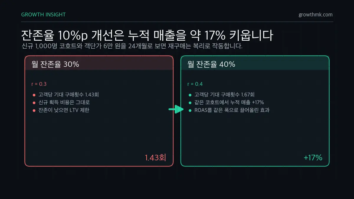
Raising retention by a few percentage points might sound trivial, but because repeat purchases compound month over month, the cumulative effect is large. As a hypothetical example, let’s calculate the cumulative purchases a new cohort of 1,000 customers generates over 24 months with no further acquisition, at different monthly retention rates (assuming an average order value of ₩60,000).
| Monthly retention (example) | Cumulative purchases over 24 months | Expected purchases per customer | Cumulative revenue |
|---|---|---|---|
| 30% | ~1,429 orders | 1.43 | ~₩85.71 million |
| 35% | ~1,538 orders | 1.54 | ~₩92.31 million |
| 40% | ~1,667 orders | 1.67 | ~₩100 million |
Raising monthly retention by 10 points, from 30% to 40%, increases cumulative revenue by roughly 17% from the same 1,000 new customers. Expected purchases per customer can be approximated with a geometric series: with monthly retention r, it’s 1/(1−r). At r=0.3 that’s 1.43 purchases; at r=0.4 it’s 1.67 — as retention climbs, the denominator shrinks and LTV grows at an accelerating rate. If acquisition cost stays flat while retention alone lifts customer lifetime value by 17%, that’s the same effect as lifting your ad efficiency (ROAS) by the same margin.
This is exactly where RFM and cohort analysis meet. The standard playbook in data operations is to use cohorts to find “the point at which retention starts to worsen,” then identify those customers within RFM’s “at risk” segment and launch a proactive campaign before they’re gone. This approach — using experimentation and measurement to lift repeat-purchase rate — maps directly onto the retention and referral stages of growth hacking’s AARRR framework.
The minimal version, no tools required: GA4 + a spreadsheet
You don’t need a dedicated CDP or BI tool to start either analysis today. What matters isn’t “elaborate infrastructure” but “the habit of consistently slicing the data by the same rule.”
| Analysis | Minimal version, no dedicated tool |
|---|---|
| Cohort | Use GA4 Explore → the Cohort exploration template. Set the inclusion condition to “Any transaction” and the return condition to “Transaction,” and you get a repeat-purchase retention table by signup month immediately. Choose dimensions and return conditions based on GA4’s official documentation (GA4 Cohort exploration). |
| RFM | Export your order data (three columns: customer ID, order date, order amount) to a spreadsheet, then use a pivot table to get each customer’s last purchase date, order count, and total spend. From there, score R, F, and M from 1 to 5 using PERCENTRANK or manual quintile boundaries, and concatenate the three scores to classify segments. |
One caveat to keep in mind: GA4 cohorts are based on device data, and User-ID is not factored into cohort creation (GA4 official documentation). So if you need a precise view of repeat purchases tied to logged-in users, order-database-based RFM will ultimately be more accurate. The reliability of both tools depends directly on the quality of your measurement setup, so before you start, confirm that event and conversion tracking is configured correctly. We cover why tracking setup matters in Why Tracking Tool Setup Matters.
Turning segments into campaigns (CRM and email)
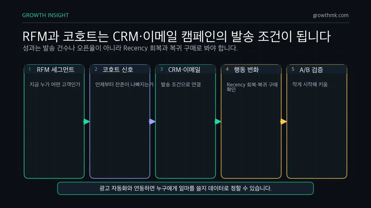
Analysis only creates value once it turns into action. RFM segments and cohort signals become send conditions for CRM and email automation directly. Here’s an example of how that pipeline — from analysis result to marketing channel — is structured.
| Trigger (segment/signal) | Channel | Example campaign | Success metric |
|---|---|---|---|
| New customers (R5·F1) | Email/messaging automation | 3-step onboarding sequence → first repeat-purchase coupon | M1 retention rate |
| Potential loyalists (R4·F2–3) | Email, app push | Subscription or bundle recommendations | Rise in purchase frequency (F) |
| At risk (R2, high F·M) | CRM-segmented ads, email | Limited-time offers, restock alerts | Return rate, Recency recovery |
| Can’t lose them (R1, high F·M) | Email, 1:1 outreach | Strong win-back offer | Win-back conversion, attributed revenue |
| VIP (R5, high F·M) | Membership, dedicated channel | Early access to new products, review requests | Retention rate, referrals |
Success here should be measured by the segment’s actual behavior change, not by “emails sent” or “open rate.” A win-back campaign for at-risk customers succeeds not because a lot of people opened the email, but because that cohort’s Recency actually recovered and a return purchase actually happened. And every segment campaign is safest when it starts small and scales up through A/B testing. We cover how to design experiments that keep improving campaigns over time in How to Improve Ad Performance with A/B Testing.
When you connect these data segments to ecommerce channel operations — especially machine-learning-driven ad automation like Meta ASC — you can decide “who to spend how much on” based on data. You can see how ad automation works in the Meta ASC Campaign Guide.
We build the operating system that finds ‘the one customer who becomes revenue’
Growth’s performance marketing team connects RFM segmentation and cohort analysis directly to ad, CRM, and email operations, designing a data operating system that measures success by actual repeat purchases and LTV, not traffic volume. If you’d like to work together on finding the ‘one customer who becomes revenue’ hidden behind the average, take a look at our performance marketing service, and if you need a diagnosis tailored to your own data situation, reach out through our contact page.
You can see the full picture of this topic in “The Ecommerce Marketing Strategy Guide — Full-Funnel, Data, and Platforms.”
Frequently asked questions (FAQ)
What’s the difference between RFM analysis and cohort analysis?
RFM is a snapshot analysis that classifies “who is what kind of customer right now” using recency, frequency, and monetary scores, while cohort analysis is a time-series analysis of “how a group of customers who arrived at the same time stick around or leave over time.” They’re most powerful together: use RFM to select a target group, then use cohort analysis to track how that group’s retention changes.
Do RFM scores have to be quintiles (1–5)?
No. Quintiles are the most common and balanced approach, but if you have a small customer base or an unusual distribution, you can simplify to tertiles, or set boundaries directly against a business rule instead of a quantile split (for example, under/over ₩100,000 for Monetary). What matters isn’t the scoring scheme itself, but applying the same rule consistently to every customer so relative positions stay comparable.
What should I look at first in a cohort retention table?
Two things. First, the horizontal “sharp drop, then plateau” pattern — the height of the plateau after the first month is the size of your core repeat-buyer base. Second, the vertical trend in M1 (first-month) retention across cohorts — if this number is rising for newer cohorts, it’s a sign that recently introduced repeat-purchase initiatives are working. The overall repeat-purchase rate gets diluted by new acquisition, so slicing by cohort gives you the accurate picture.
Can I do this with just GA4 and a spreadsheet, without a dedicated analytics tool?
Yes. For cohorts, use GA4 Explore’s Cohort exploration template, setting the inclusion condition to “first purchase” and the return condition to “transaction,” and you’ll get a retention table right away. For RFM, export order data (customer ID, order date, order amount) to a spreadsheet and score it using pivot tables and quantile functions. That said, the reliability of both analyses depends on the quality of your event and conversion tracking setup, so check your measurement setup before you begin.